Real Data
When looking for assignments for our classes, in addition to trying to craft assignments that develop and reinforce key ideas, we also strive to come up with ideas that "speak" to the students and keep their interest. We write small games, use problems within the student's experiences, and in general try to find problems that are appealing.
This is much easier to do when the kids can read data from a file. The tool we're using with our sophomores right now is Python and Python makes reading files very easy. Combining file input with basic string functions and all of a sudden, we can read and parse comma separated values.
{% highlight python linenos %} l=[] for line in open(filename).readlines(): l.append(line.strip().split(",")
True, this doesn't handle quotes and embedded commas, but that just leads to a discussion on cleaning up data and when we do list comprehensions, things get even slicker.
We could just make up some sample data, for example, student test scores:
Tom,95,87,97,93
Sarah,98,98,84,92
Harry,90,90,90,90
Sue,94,95,96,97
But it's so much more fun with the wealth of CSV data waiting to be grabbed. If your kids like sports, you can check out baseball-reference.com or it's counterparts for basketball or football.
We decided to look at government data instead.
Federal data can be found at data.gov but we focused on New York City. We settled on SAT data. SAT math, reading, and writing scores for all NYC public schools. Something Stuy kids are very interested in. We were able to look for comparable schools, which schools had large spreads between math and verbal, which schools had score increases over time, etc.
Much more interesting to look at real SAT data than made up student grade info.
Tomorrow we'll look at combining data sets -- looking at the relationship between SAT scores and school ratings and demographics. It should be interesting. Later, we'll grab books from Project Gutenberg and see how we can analyze large texts.
The moral of the story - there's lots of great data easily accessible -- let's use it to motivate and engage our students.
UPDATE:
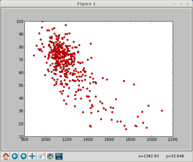
It's taken me a while to post this, and in the meantime we analyzed the SAT data from one NYC data set and matched it with a data set of demographic data:
The graph shows a strong correlation between schools with a high number of students eligable for free lunch (the Y-axis) and low SAT scores (the X-axis). This led to a very interesting conversation on the effects of poverty.
We also noticed a couple of outliers. There's one school at about (1400,82). High poverty (free lunch) and national average SAT. Also two schools with low free lunch numbers and middling SAT scores (1400,17ish).
The (1400,82) point turns out to be a school that caters to English Language Learners and we presume has a large number of recent immigrants (partially noted by the name and also by the fact that their SAT math scores far surpassed the English ones).
Great discussions ensued all due to applying CS to real world data.


Comments
Comments powered by Disqus